|
Look around you, our surroundings show how powerful design has become. Design shapes the way we communicate and educate. Companies are leveraging design as a comparative weapon, and it is working. Good design can be the difference between customers buying your product over competitors.
Studies have shown that many of the benefits of good design come from its beauty. Color affects our moods. Shapes affect our ability to digest information. Patterns have universal appeal. Graphic artists can use these insights to design an ad or product that appeal to consumers. However when one of these tools is used incorrectly, bad design hurts. Even seemingly subtle differences in design can have negative effects over time, like neck aches as a result of a poorly shaped pillow, or eye strain due to overly bright lighting. It is simple in that, good design is visually appealing and can also be functional. Read further from a insightful article by the New York Times: http://www.nytimes.com/2013/02/17/opinion/sunday/w...
0 Comments
Did you know that 90% of product design decisions are based on color? Color has many associations with different areas of life, and can influence a viewer based on culture, background, and psychology. In addition to color choice, the typeface choice in a design has an effect on the viewer and reader just as well. A large amount of someone’s first impression of a company comes from its typeface, and with it, the meaning that it conveys. There are four major psychological factors in typographic design—inferences, meaning, legibility, and look and feel.
Interpretation The style of the text has a large impact on the viewer’s perception, even if the viewer doesn’t have much knowledge about typography. For example, using a bold typeface generally indicates importance and power, and script fonts imply sophistication or luxury brands. Some more decorative typefaces have specific themes that can be used to influence the viewer’s interpretation of the design. Connotation Visual and verbal meaning can go hand in hand when the connection between them is natural. A study found that many people prefer round, soft fonts and found them easier to read than more angular ones. Legibility The legibility is the first, and most important, part of any type design. If you can’t read it, it becomes pointless and distracting, but if it is too simple, the reader will skim by it and not remember it as easily. Finding this balance between legibility and simplicity is key for a good design. Look & Feel To make a memorable logo, the most important thing to think of is how to make it feel like the company. Find a good combination of color and typeface to create the perfect fit for you; do you want to be seen as structured, friendly, hardworking, approachable, fun, or a combination of many? It’s up to you to make that first impression lasting. Whether you need to gain a competitive advantage, expand or evolve your company, or have simply outgrown your original mission, it could be time to re-brand.
A well-executed re-brand can help gain competitive advantage or tap into a new demographic. To keep a business moving forward it is crucial to tap into a new audience.A new image can allow a company to reflect the current market and become a dominant player in the industry. A re-brand can also develop into an expression of a company’s progression. As a small business thrives, a rebrand can reflect the larger, more refined company. Businesses that fail to evolve their brand risk being taken over by their more dynamic competitors. This can also apply if a business has outgrown their original mission. As a company develops from one ideal to another the image has to change with it. A brand is the public face of a business and must represent accurately the ideals and services that are provided. “Key to a company’s relevance is the evolution of the brand,”Jim Freeze, CMO at Aspect. Infographic by Emma Bazilian
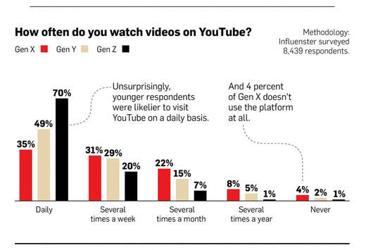
How often does your generation watch YouTube videos? According to a poll of nearly 8500 people, a large majority of people surprisingly watch videos on YouTube every day. What’s not very shocking, though, is that the generation that watches the most is Gen Z, with 70%. A poll from Defy Media shows people from the ages of 13 to 24 watch an average of 12.1 hours of video per week, just on YouTube, and another 8.8 hours on Netflix--that’s a lot of screen time! In fact, 67% of people said they “can’t live without YouTube.” The type of videos that the generations are more likely to watch definitely vary, and for the most part, seem to make sense. How-to videos were popular among the older generation Gen X, as well as product review videos. These product review videos were also watched by those in Gen Y and Gen Z—they’re just great all around! Finally, unboxing and haul videos were popular with both Gen Y and Gen Z groups, and untouched by Gen X. Overall, Gen X watched the most educational videos, Gen Y watched the most workout videos, and Gen Z watched the most vlogs and style videos. Together, all of the generations used YouTube over Facebook and Instagram to watch their videos, and the majority of viewers only watch videos of people they don’t know, only 14% of viewers watch videos of friends or family. Read the whole article at http://www.adweek.com/tv-video/infographic-how-gen... |
Categories
All
Archives
June 2017
|


